Introduction
If you’re using a mobile browser to read this article, chances are high that it’s either a Chromium based Blink engine powered browser on Android or a WebKit engine powered browser on iOS. In fact, all browsers on iOS are actually WebKit based because Apple forces all third party browsers on iOS to use WebKit, essentially making them just re-skinned versions of Safari.
Unless you’re among the 0.35% of the world’s mobile users who prefer Firefox on Android.
Well, don’t get me wrong here. I’m a Firefox user myself, but only on desktop. Sadly on mobile, the picture is quite different.
At this point, you may ask, “What’s wrong with Chrome? I’m happy with it. Why do we need to discuss Firefox?”
Why is it necessary to have a competitor to Chrome
The question demands a comprehensive article in itself, but instead of digressing (yet to understand the context), let me attempt to lay down briefly why it’s necessary to have strong competitor(s) to Chrome.
Everyone using Chrome is not healthy for the industry.
Monopoly is unhealthy. Web developers are forced and encouraged to code and optimize their applications specially for Chrome. Why optimize or even code for a small number of people who use non-Chromium based browsers? It’s reminiscent of pre-Firefox era when Microsoft’s Internet Explorer was the dominant player. It stifles competition and innovation.
And after Microsoft too embraced Chromium to build the next generation model of its Edge browser, there’s only one non-Chromium based browser in the market today.
No prizes for guessing, it’s Mozilla Firefox.
The current state of things at Firefox
Realizing that its Android browser offering weren’t going anywhere (although Firefox Focus was a decent effort), the team decided to rebuild Firefox for Android from scratch.
That’s right.
Throw everything out of the window. Start with a clean whiteboard.
And they code-named it Fenix. (Publicly available for testing as Firefox Preview)
The new application is powered by GeckoView, an Android wrapper around Gecko browser engine that fuels its popular Firefox Quantum desktop version.
Eventually, it’ll replace Firefox for Android app on the Play Store.
Reimagining the browser of the future: Firefox for Android
I have been using Firefox Preview long before it was available in the Google Play Store by acquiring a build through its repositories. They are making good progress and are expected to launch the polished version shortly.
Having sent them a couple of long- ish emails on features to add/remove along with general feedback, I’ve decided to put my product manager hat on to reimagine my version of Firefox for Android.
Since I don’t have access to their Telemetry data (Firefox collects non-personal performance and usage info to improve their products), my suggestions are based on years of personal experience using web applications, mobile apps (specially on Android), feedback noted from users on their app store, feedback and issues mentioned on their repositories, best user experience practices implemented by competing/non-competing products and assuming (from comments) their current product team’s psychology & roadmap.
I want Firefox to succeed.
I want more people to embrace or go back to using Firefox. They should have a choice to switch. And the choice should be a good one. Not just a decision based on principles or ethics.
I want more people to be delighted while browsing the web, feel fast, feel safe, feel private.
But it’s easier said than done because there are a lot of factors involved. E.g. how do you make a product loved by both average internet user and power users? How do you win in a market dominated by a big competitor who also pays your bills. (discussed later below)
That’s the reason I’ve divided the next section into three equally important sections:
- Design
- Market
- Challenges
Design
Anyone who’s ever been involved in Agile methodology of development would agree that there’s no better way than to design, build/test, feedback and iterate.
Talking of design, there are 4 sets of feature groups I would love Firefox to focus on:
- ‘Permission to play’ (P2P) features
- Bare minimum features of a mobile browser provided by your biggest competitor that people are used to. Without these features, you can’t have ‘permission to play’ in the market.
- USP features
- Privacy/better control over privacy (a core differentiating value of Mozilla, to be discussed shortly below under ‘Market’)
- Modern intuitive UI
- Good to have features
- Features for Power Users
- Features to remove
- Features from the current iteration of the product that are redundant or don’t add value. (to be discussed shortly below)
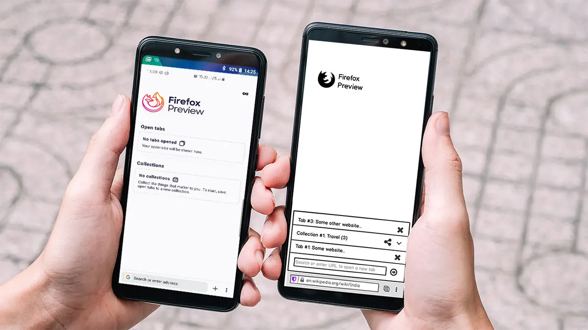
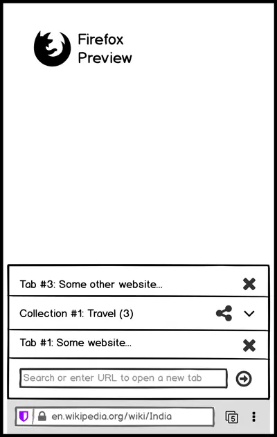
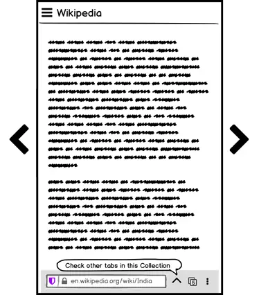
At present, here’s how Firefox Preview looks like:
Few notable features:
- Bottom address bar for better thumb only operation & bigger screens.
- Collections, which is a nifty new way to manage tabs into groups that can be named, shared, deleted.
- Tracking protection is on by default.
- Dark mode (not that important at its current iteration but nevertheless, it’s there)
If you want to give it a spin, download the nightly build from here.
Since the product is in its active development stage, the product guy itch in me couldn’t resist but suggest changes to its current design and interaction.
Design & interaction suggestions:
1. What/Requirement: Pull down to refresh page
Why/User Benefit/User Problem: Users are so used to pull-to-refresh feature that it has become a P2P feature. Save a tap.
2. What: Main menu can be grid layout
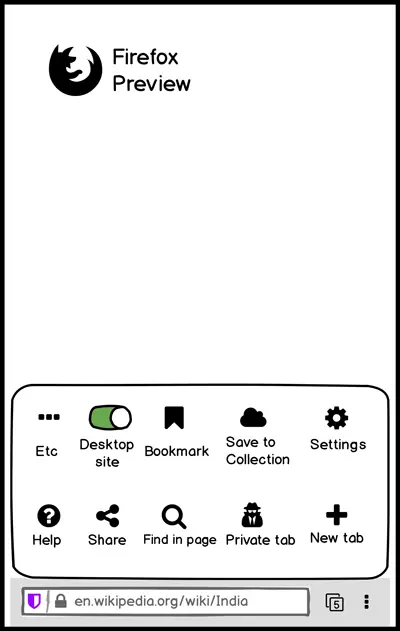 Why: The motive of moving the Address Bar (also referred to as the Awesome Bar) to the bottom is to enable better usability using the thumb. Moreover, mobile phones have become taller than earlier, hence stacking things at the bottom helps.
Hence, the menu can also be a horizontally stacked grid (closer to bottom), rather than the current vertical layout.
3. What: URL need not show https/http and www
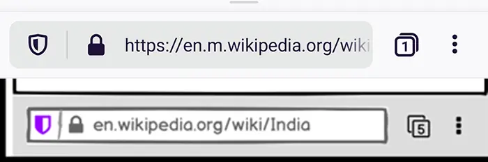 Why: The shield icon to the left of the address is already a visual indicator of secure or insecure connection. Furthermore, the current implementation is unlike the desktop version where it’s colour-coded in green for https and grey for http. (which in itself isn’t very helpful for partially/full colour-blind users)
A user survey can be done regarding this. Moreover, nobody cares if there’s www in front of the website URL or not.
It will clear up costly real-estate in the Navigation Bar to fit other more meaningful items/icons.
4. What: Tab-switcher need not lead you to the homepage. It shouldn’t leave the context of the page. A new design is proposed below that’s in line with the intention of moving towards a more intuitive bottom-stacked, easily accessible design.
 How: (Design Idea #1)
1. On tapping on the tab-switcher icon, a window will slide-up from the bottom of the nav bar revealing the open tabs and collections as rows stacked on the top of each other (latest tabs to oldest sorted bottom to top) without the user leaving the current page.
The current page can be blurred/overlay/clear behind the slider.
Each row will have a close button. Collections can have share button, as well.
2. The bottom-most row will have an address field to open a new tab directly thus saving another tap. The address of the current page can be greyed out to clearly maintain the difference.
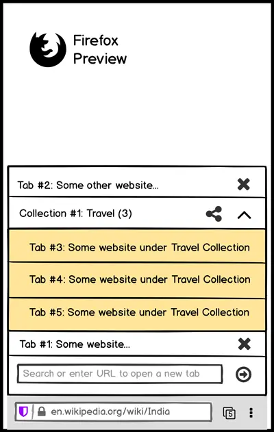
3. Collection rows will have a down-arrow icon to indicate that it has more content collapsed within it. User can tap it to reveal the tabs under each collection just like an accordion.
It will also show the number of tabs within it numerically. Each tab within a Collection can also have a close button. (not shown in my mockup above)
Users can tap on the name of the collection to edit its name.
(Design Idea #2: Alternate approach for horizontal preview) How:
1. On tapping the tab-switcher icon, a window will slide-up from the bottom of the nav bar revealing the open tabs and collections in small-square previews (referred to as squares from now on) scrollable horizontally.
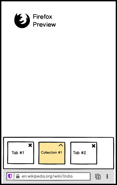
2. Bottom-most row to remain as mentioned in Design Idea #1 (not shown in the mockup above)
3. Collection squares can be tapped to reveal a slide to top vertical square previews of tabs within in as shown below.
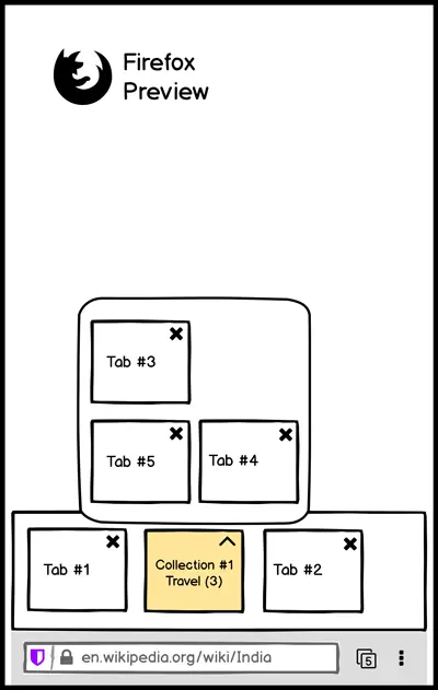 Why: The current design leads the user to the homepage where tabs and collections are stacked top to bottom defeating the purpose of bottom accessibility. Moreover, you lose the context of your current page.
5. What: On scroll-up of webpage, hide the bottom nav bar.
Why: More real-estate, intuitive. P2P feature, IMHO.
6. What: Swipe left/right on Address Bar to move to prev/next tab mimicking Chrome.
Why: I believe it’s a good use of a phone’s swipe ability. It’s quick, it’s productive.
7. What: If a tab within a Collection is open, give the user a quick way to move to other tabs within the Collection.
There can be two ways to achieve this. Both can be implemented together or individually.
1. An arrow-up indicator in the Nav Bar tapping which will reveal the other tabs in the current Collection. (similar to open tabs feature #4 discussed above)
2. Swiping left/right on the webpage open to move to next/prev tab in the Collection. The left/right chevron in the mockup above is just a swipe indicator, it won’t actually be visible on screen.
Why: Items within a collection should be easily accessible requiring the minimum effort.
8. What: While entering text to search or entering URL, helper buttons can be introduced in a new bar.
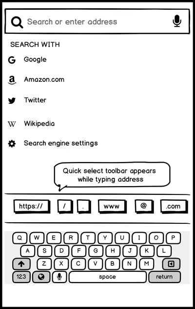
The buttons can be the often used, .com, @, /,www etc.
Why: Although, these are accessible on the keyboard, it will save time since these buttons are usually not available on single tap.
9. What: Tab-switcher and Home Button should be separate
Why: Currently, the tab-switcher icon takes the user to the homepage. It creates back button ambiguity, wherein pressing back exit the app. In a homepage scenario, it’s the expected behaviour. Whereas, if the user’s intention was to switch tabs, but decided against it, back implies leading the user back to its original page. This is where the current version creates an ambiguity.
If tab-switcher (as discussed in #4 above) is implemented, this issue gets resolved. Then we just need a new home button as shown below.
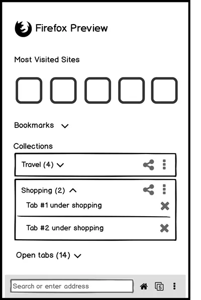
Home button can have the search bar, most visited sites, bookmarks (from desktop + mobile), then collections, then open tabs.
If Firefox really wants to keep the present design intact, implement double confirmation on exit. E.g. Press back again to exit. Or popup asking, ‘Do you really want to exit?’
10. What: Remove the + sign in the new tab page.
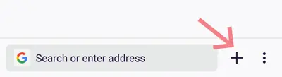 Why: This is redundant. Pressing it only moves focus to the address bar, fires up the keyboard. In fact, the keyboard is right next to the + sign. There’s no need for it. Save a tap.
11. What: Reopening already opened tabs in collections shouldn’t show them again in open tabs section and shouldn’t increase the tab count in the tab-switcher.
Why: A bug in the current iteration.
A lot of feedback on the Play Store mentions the lack of add-ons, bookmarks and the ability to move the bottom bar to top. While add-on support will be introduced, I’m assuming, after a stable release, the team can surely consider adding bookmarks and option to move the Address Bar to top (for smaller screen devices and for people who prefer it that way). But they’re not deal breakers, as of now since it’s a preview release.
Market
Anyone who has ever built any product knows fairly well that it’s not always the best product that wins. While we discussed adding/removing features in the previous section, it’s a fact that you need more than just the best product in the market. You need to market it, promote it, brand it, amplify the emotional quotient of it, increase its perceived value.
The price of a browser can be free, but it should be valuable.
The price of a shirt can be Rs. 500, but as soon your grandmother gifts it to you on your birthday, its value almost touches infinity.
In my opinion, companies should have core values that should reflect in their product communications. Thankfully, Mozilla already has a big one: privacy.
- Be bullish on privacy (core value)
In this age of blatant disregard for privacy, Firefox might just have the perfect recipe to succeed. While more and more people are waking up to the reality of their privacy being compromised, we can assume that a cohort will look out for alternative products that promise them more privacy. Mozilla just needs to make sure (through the proper marketing channels) that Firefox’s narrative is discoverable when people are looking for it.
- Appeal to paid/unpaid power users
A major section of current Firefox users are power-users, developers, tech-enthusiasts and early adopters. In June 2019, during an interview Mozilla CEO Chris Beard mentioned that paid subscriptions will be launched with Firefox. As per reports, they’re testing VPN services and cloud storage and I feel that’s a good strategy.
They can easily partner and bundle services like VPN, faster & secure internet DNS routing like Cloudflare’s WARP+, secure email service providers like Proton Mail, premium Password Managers etc. and offer them at a cost-effective price. Users can have a la carte option to cherry-pick services to subscribe to.
Non-paying power users can be retained with better developer tools, freemium services etc.
- When you don’t have money to be on TV, find a way to be on TV
When you’re competing with companies with big pockets, you need to be creative to get that extra media attention. You simply can’t outsmart them with PR and paid marketing campaigns, you’ll have to be creative.
You’ll have to find a way to reach large audiences with minimal investment.
If you can’t pay to be on TV, you need to do something that makes your story irresistible for reporters and journalists.
Ice Bucket Challenge, Kiki Videos are few examples.
Challenges
It’s easier to write a 3000 word blog than to actually execute things to succeed. Because, well…as Monica from F.R.I.E.N.D.S famously said, “Welcome to the real world. It sucks! You’re gonna love it.”
The real world sucks and it’s riddled with challenges. But we love it nonetheless.
Firefox is no exception to this rule.
- Chrome comes pre-installed on most Android phone
There are 2.5 billion active Android devices. And most of them have Chrome pre-installed as a system app, you can’t even uninstall it. Even the thought of competing with such a behemoth is upsetting.
- 89% of Mozilla’s income comes from search engine royalties
Google is the default search on Firefox browser and it pays Mozilla royalties to keep it that way. In fact, 89% of Mozilla’s $562 million income in 2017 came from Google and other search engines like Yandex in Russia and Baidu in China.
The contract with Google will expire in November 2020. While there are chances that Google will continue paying Mozilla to keep a competitor in the market, but just in case, if it has other plans, Mozilla might find itself in a financial soup.
- Technical issues
If you’ve ever used Firefox on mobile, you would have surely noticed how horrible Google search results look, in spite of Google being its default search engine. This issue has been pending since the last 5+ years. Go figure, if you’re curious why.
Too little, too late?
Firefox could have partnered with handset makers like Samsung early in the game to become the default on their phones. But that ship has already sailed. Samsung builds its own browser (based on Chromium) and is doing pretty well keeping up with latest trends and understanding user need and behaviour.
It can still partner with newer companies, but a potential problem could be a conflict of core values. Handset makers might not be too keen on privacy as a feature. They might want to optimize it for more profit say, by adding paid content widgets into the browser, tracking user behaviour to capitalize on the insight and so on.
Has Firefox already lost the game?
Probably not.
The only thing constant in this world is change. And if Firefox keeps reinventing itself to become relevant, it will never be out of the game.
After all, there comes a time when people cheer for the underdog because even after falling down seven times, it always stands for a fight for the eight time.